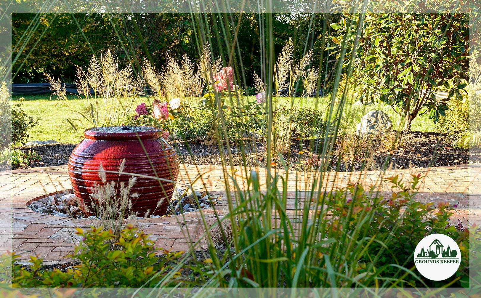
Your garden’s color story doesn’t start and end with flowers.
Sure, blooms are the obvious drama. When the rhododendron bursts into a profusion of blooms in early spring, you notice. The moment a hydrangea unfolds from bud to bloom, you notice. But if you’re only looking for color when petals are open, you’re missing the texture, depth, and visual richness that lives in your landscape all year. The real palette is so much bigger than that.
We’re talking bark that furls like paper. Stone that ages into a rich kaleidoscope. Moss that softens a garden. Koi gliding beneath the surface of a pond. Ornamental grasses in copper and silver. Planters that hold their own design weight. Foliage so rich it doesn’t need flowers to command attention.
These are the elements that make a landscape feel nuanced and alive, not just in May, but in December and year-round. And when you start looking at color through that lens, everything changes.
 Bark & Branches: Nature’s Skeleton Crew
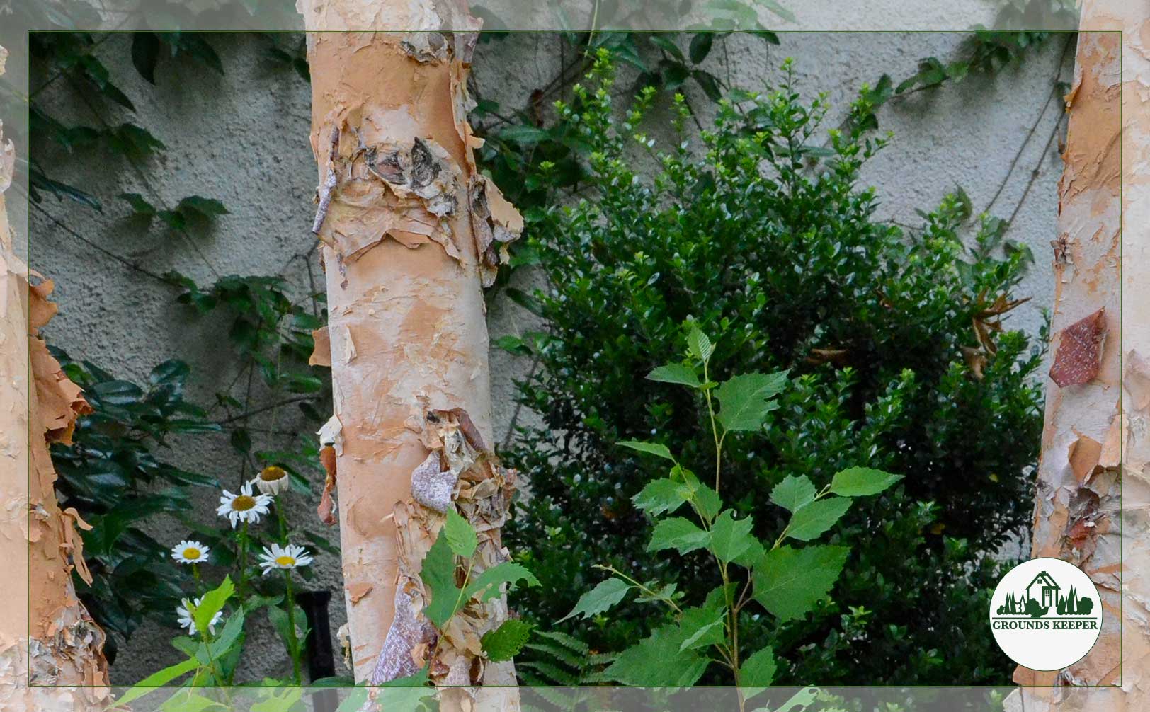
Winter gets all the credit for revealing branch structure, but that’s only half the story. Bark is a color element in every season.
Some trees do the visual heavy lifting year-round. Paperbark maple has exfoliating bark in shades of cinnamon, cream, and rust, peeling back like birch paper to reveal layers underneath. Red-twig dogwoods glow in winter, then fade into burgundy-tinged stems in summer. A single tree becomes a sculpture.
Colorize your space!
Color is everywhere when you look through the lens of a great landscape design. Want to explore how to add color to your space through winter or summer, rain or shine? Let’s talk!
But it’s not just about obvious color. The texture of bark tells a story: smooth American beech, deeply furrowed oak, silver-striped birch. When light hits them at different angles, from early morning to dappled afternoon and twilight-tinged evening, they shift. Wet bark is darker and more dramatic. A tree in morning frost brings something completely different than the same tree in afternoon rain.
The fun part is designing around the gifts Mother Nature has already given us. Strategic pruning reveals structure. Removing lower branches on a birch lets you see that white trunk all the way down. Leaving some ornamental trees unpruned gives you dense texture and playful shadows. It’s about choosing what you want to show.
Bark isn’t a placeholder for when flowers arrive. It’s a design choice with a color palette all its own.
 Stone, Hardscape & Gravel: The Frame That Holds Everything
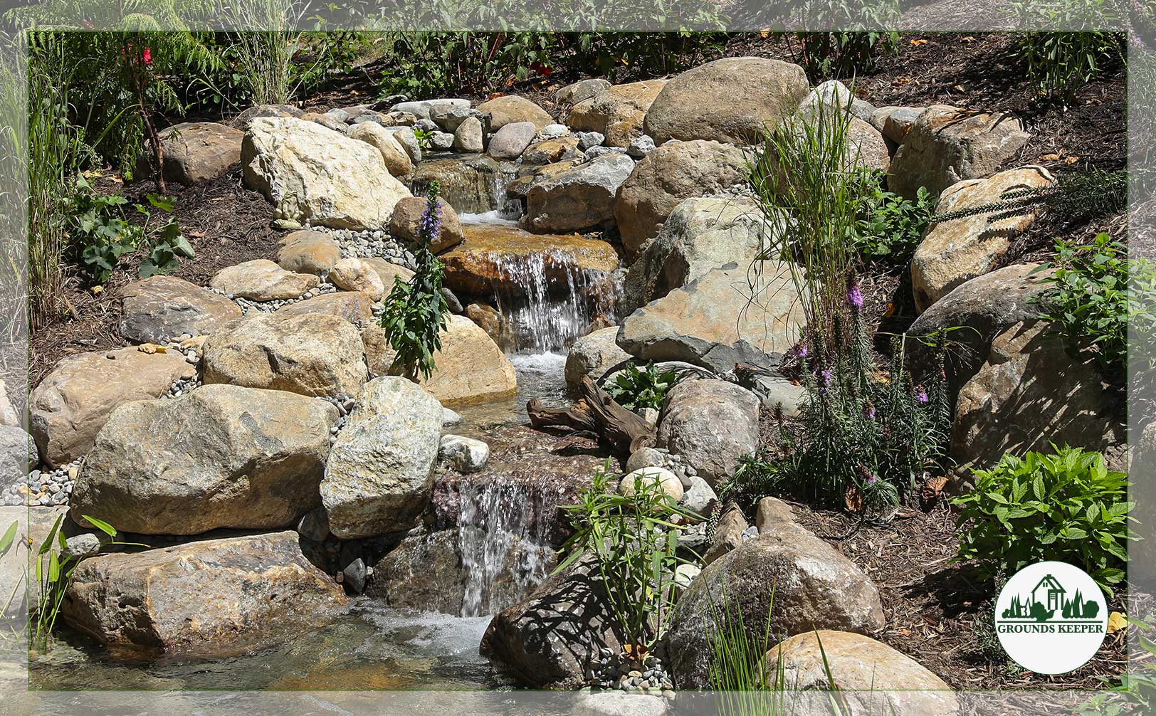
Stone is the anchor that makes all the other colors work.
Think about your driveway, your pathways, your retaining walls. These aren’t just functional, they’re the backdrop against which everything else happens. A cool bluestone path makes surrounding greens look richer. Warm terracotta pavers change the whole feeling of a space. Grey granite reveals different hues than warm buff sandstone.
Here in New Jersey, you’re surrounded by stone that has character. Bluestone has depth and subtle variation. Slate can be charcoal, grey, or rust-tinged, depending on how it’s cut. When you choose stone for your landscape, you’re choosing a color family that will influence everything planted near it.
Here’s another color truth that most people don’t realize: the way stone ages brings a whole new palette to your space. It develops patina, catches lichen, weathers unevenly, and looks like it belongs in the landscape instead of sitting on top of it.
That isn’t decay, it’s beautiful.
Follow us on Instagram for more lifestyle ideas and inspiration!

Gravel works the same way. You can choose warm tones like rust-colored pea gravel and golden crushed stone, or cool ones like grey pea gravel or blue slate chips. These aren’t neutral backgrounds. They’re color decisions that change how your eye moves through the garden.
When you layer stone with the same care and attention that’s usually reserved for blooms, it becomes the frame. Everything else, from the moss creeping at its edges to the plantings rising above it and the water reflecting off it, becomes more vivid.
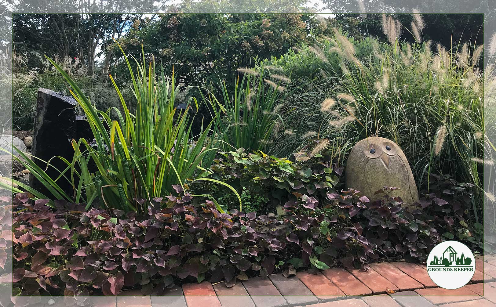 Living Color Beyond Flowers: Foliage, Moss & Ornamental Grasses
Let’s talk about the plants that don’t flower—or do, but that’s not the point.
Moss is underrated. Most people see it as a problem to solve, but moss is texture. It’s a velvety soft green that catches morning dew and glows. It thrives in shade where nothing else will, and it softens hardscape edges in a way that feels naturally aged. A stone pathway edged with moss stops looking like infrastructure and starts looking like it grew there.
Foliage plants are where color really lives. Hostas come in chartreuse, blue-grey, and deep green, some with white variegations that catch light. Ferns unfurl in spring and hold their unique architectural shape all season. Hellebores stay green and blooming from winter straight through spring. These aren’t supporting actors waiting for flowers. They’re the lead role.
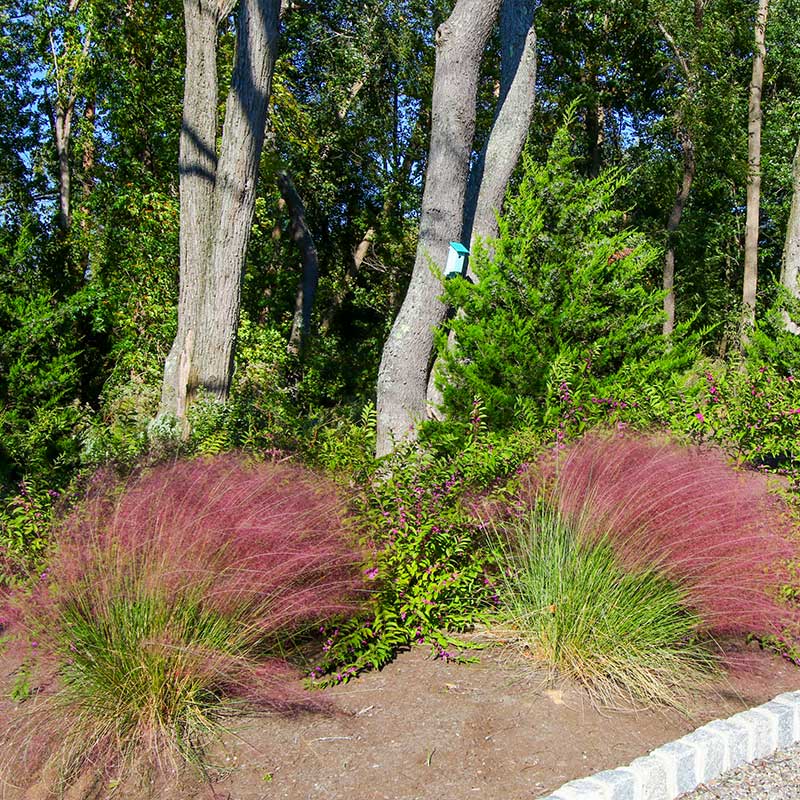
Ornamental grasses tell their own color story. Feather reed grass stays upright and gold-tinged year-round while Miscanthus shifts from green to copper to pale tan. Dried grasses in winter, when everything else is dormant, become the visual focus. They catch frost, cradle snow, and move in the wind. That movement is part of the palette, bringing depth and subtle changes with every shift in light.
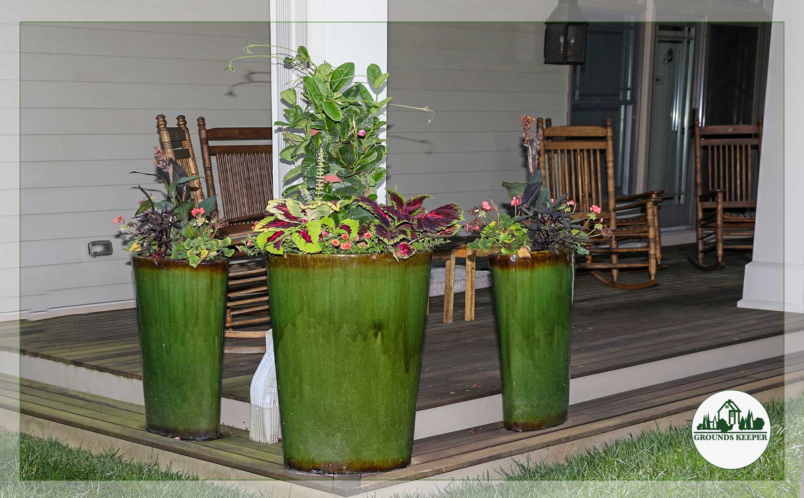
And then there are the planters themselves. A weathered terra cotta pot is a warm, earthy color anchor. A bold ceramic planter in teal or rust becomes a focal point. Grouping pots in a range of warm or cool tones creates rhythm. Planters aren’t just vessels, they’re design elements in their own right.
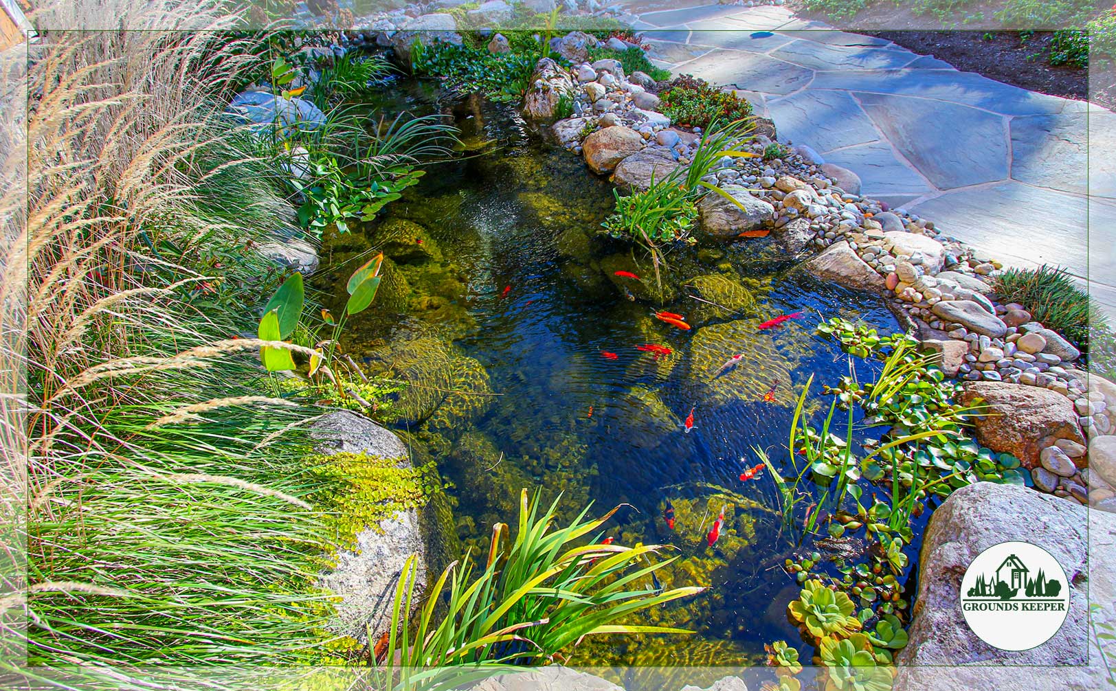 Water As A Living Palette
A pond or water feature isn’t just something to look at. It’s something that changes how you see.
Still water reflects the sky, clouds, and surrounding plants. It’s a living mirror that changes throughout the day. On an overcast morning, it’s grey and moody. In the afternoon sun, it’s bright and blue. In autumn, it reflects amber and rust, and in summer, it’s incandescent with greens. That’s dynamic color.
Add koi or goldfish, and now you have bold color in motion. A flash of orange beneath the surface or the way light catches scales brings life to a space in a way that’s pure delight.
Enjoying these ideas? Sign up to get more delivered to your inbox! (Plus offers and sales from our showroom!)

Even the water itself has color. Clear water looks different than water with aquatic plants. Waterfalls and bubbling features bring a cascade of turquoise, emerald, silver, and pearl.
As a pond ages and settles, surface algae, aquatic plants, the angle of the sun, and even underwater lighting all change the palette. A mature pond looks nothing like a newly installed one, and that aging is part of its beauty.
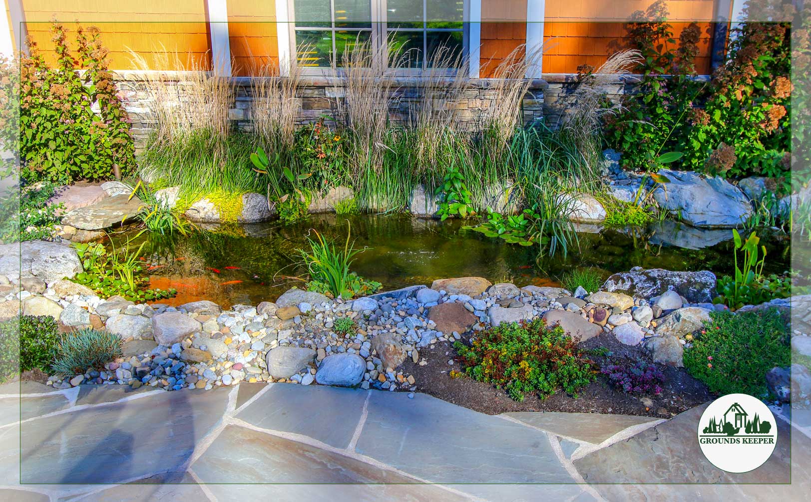 Layering: How It All Works Together
This is where things get really fun. Think bark against stone. Moss creeping at the water’s edge. Copper-hued grass catching afternoon light with dark gravel anchoring it to the earth. Fish visible through water the color of the sky.
Together, these elements are nature’s choreography.
When you understand that your landscape has this many color sources, you stop thinking about it as “flowers or nothing,” and you start seeing what’s beautiful right now.
And that’s the moment it stops being a yard and becomes a landscape that invites you to spend more time outdoors.
 Your Palette Is Bigger Than You Think
The real magic isn’t in choosing between flowers, it’s understanding that your landscape has such an abundance of color, in bark and stone, moss and water, foliage and light. Once you see it that way, you can’t unsee it.
A beautiful garden isn’t built on blooms alone. It’s built on understanding how all these elements work together across the seasons. It’s the difference between a yard that looks the same every season and one that feels alive all year.
If you’re ready to stop thinking about what’s missing and start designing around what’s possible, let’s talk. We’d love to explore your landscape and the color story it’s waiting to tell.
Book a consultation with us, and let’s get started.